


TLDR: I had a zoom chat with CTU Economist Craig Renney about the surprisingly-high annual inflation figure of 7.3% in the June quarter, and what it might mean for the Government, the economy, workers and the Reserve Bank.
We spoke in and around a little powerpoint deck I put together from the figures. This is a bit of an experiment and welcome feedback from paid subscribers below. It’s available for both free and paid subscribers, and can be shared with anyone.
I’ve included the key charts discussed below for those wanting to look at them in another format.
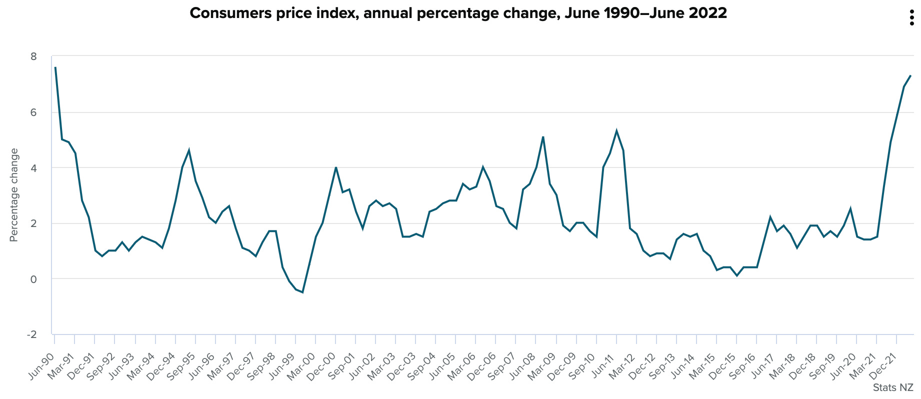
CPI rose 7.3% in June Qtr vs a year ago
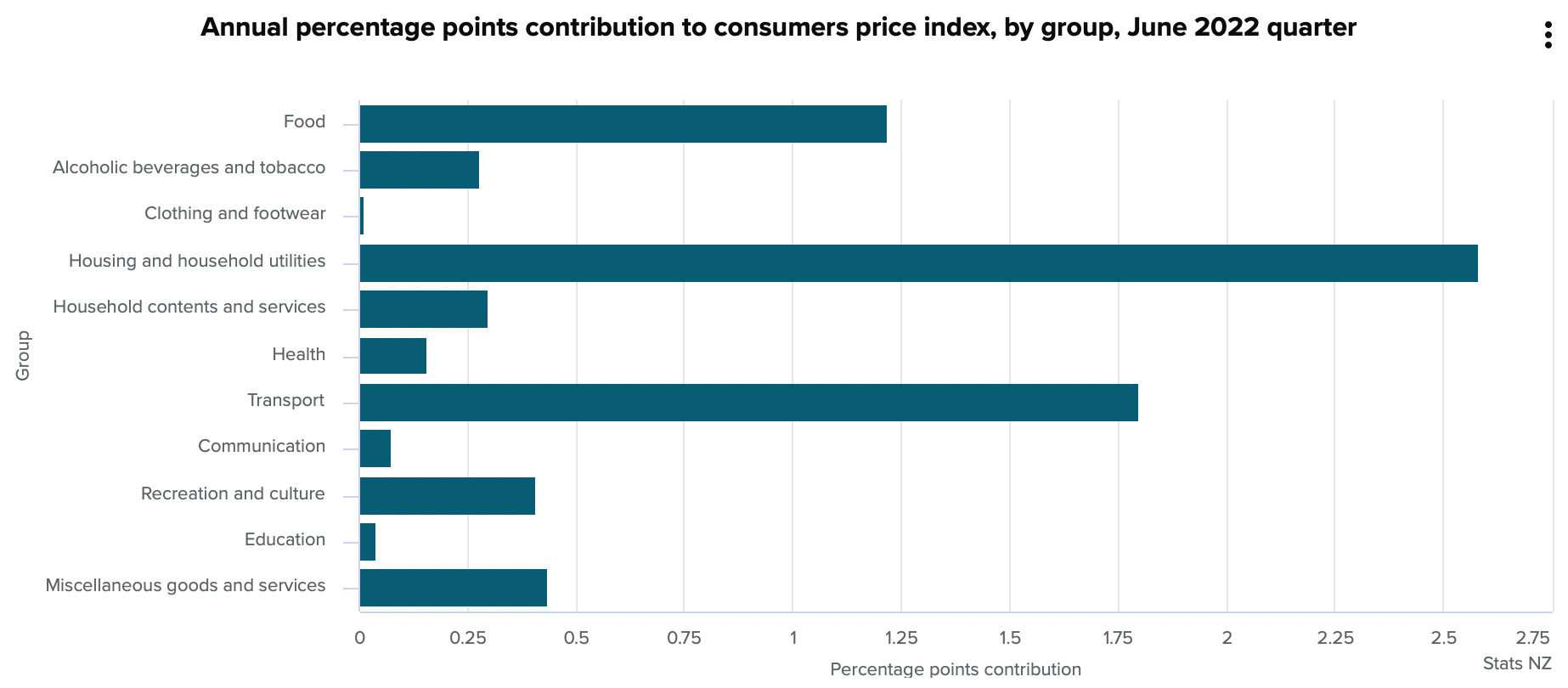
What contributed most
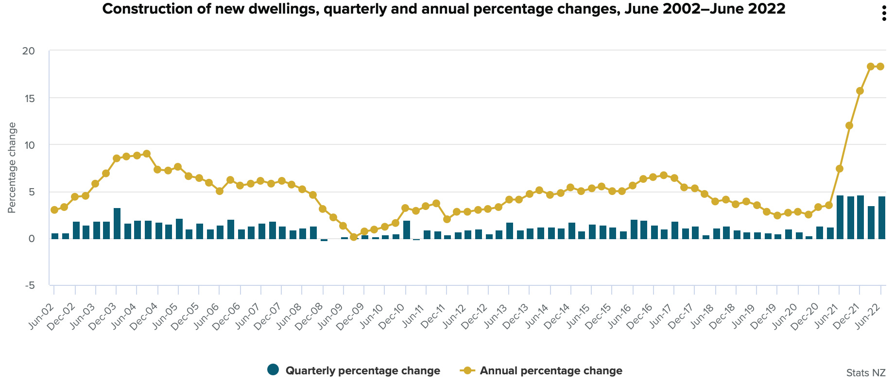
New home building costs up 18% in a year
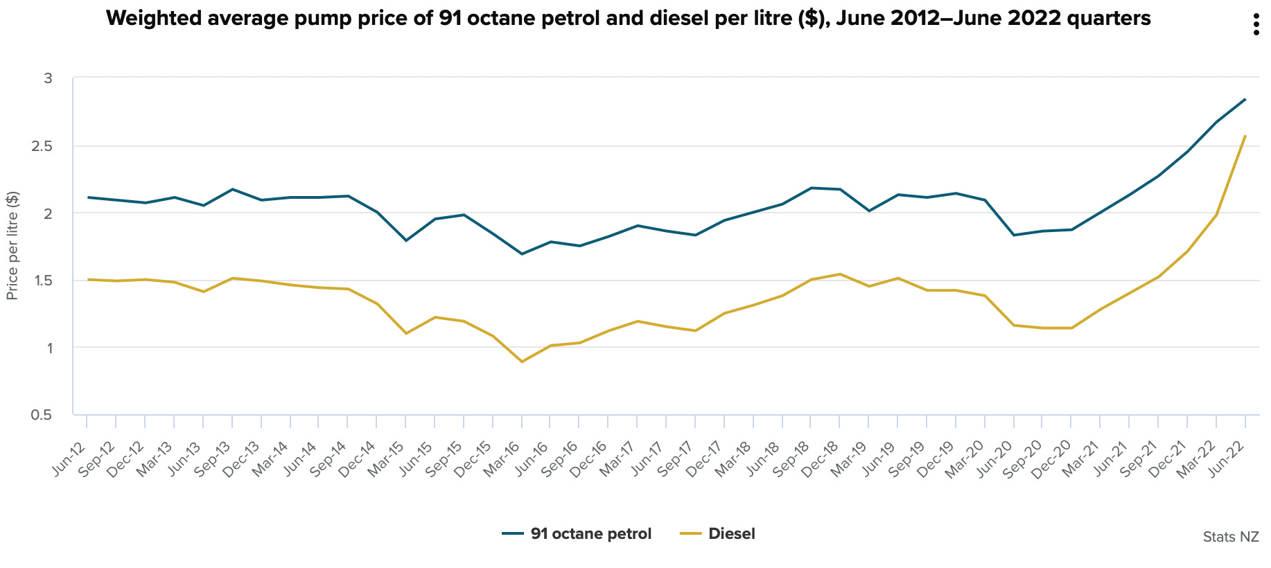
Regular 91% in June qtr, while diesel rose 30%
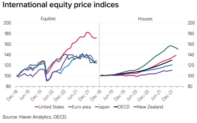
The printing pumped up asset prices
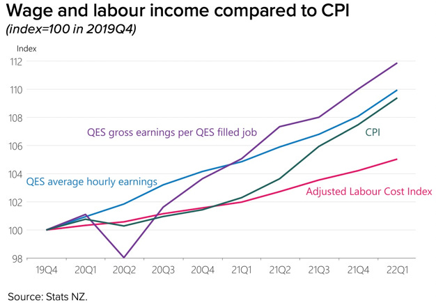
Household incomes actually up more than inflation
I welcome your feedback below.

Share this post